Artists and craftspeople know that the colours they choose — and leave out — are critical ingredients in their works' success, no matter the medium.
Colour done well is captivating. Color done badly? It's just bad. Or drab.
Yet a colour tweak may be all it takes to turn up a piece's vibrancy and magic.
An eye for colour is both intuitive and learned, say the experts.
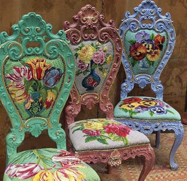
Kaffe Fassett has spent a lifetime experimenting. The septuagenarian is exuberant with colour in his embroidery, knitting and fabric designs. He's known for bold florals, fruits and vegetables, and geometric shapes — in sweaters, knitted coats and needlepoint. The author of 15 books, his latest, "Kaffe Fassett Quilts: Shots and Stripes" (STC Craft, 2013), goes minimal with vibrant swaths of colour — a simplicity that's a stretch for him.
A Londoner for 40 years who was born and raised in California, Fassett eschews conventional colour rules, although he subscribes to a few intuitively.
"I left art school the minute the colour wheel came out," he muses. "I thought that was the work of the devil."
When Fassett talks about harmony and "bounce," his language is as energetic as his artwork.
"Pick up one colour and stick it next to another and see if you get a bounce from it," says the textile artist. "Colours can either dampen each other or they can light each other up. It's just fantastic to see colour that is pulsating. It's just vibrating with life. Other times, the most wonderful colour is dropping dead because it's in the company of something that's killing it."
"I want to make the colours lush," Fassett continues. "I'm after the glow all the time."
During the quilting workshops he teaches in the United States and elsewhere, including online, he recommends using myriad shades of the same colour to create depth and harmony.
"Whenever possible, you have 10 shades of something rather than just one," says Fassett, who is inspired in part by faded, antique carpets.
For example, while knitters are usually told to adhere to a single dye lot when buying multiple yarn skeins for a project, Fassett recommends working with several dye lots.
"I never had dye-lot angst," he says. "Just the opposite. I loved when a colour ran out."
Also, stick to a colour theme but make it "pop" with little surprises of a different colour. That ensures a piece won't become muddy or drab from a colour theme's overuse. For example, if you're working in warm tones of red and orange, inject a little cool blue. This works in quilting and in other artistic media, such as painting.
"It can go very mushy if you don't have enough vivid differences," says Fassett.
In quilting and other textile arts, mix up the fabric patterns — use both large and small prints — to add interest.
Anna Maria Horner, a Brentwood, Tenn., fine artist turned fabric and home-decor designer, echoes some of Fassett's tips.
"What people overlook is arranging the light and dark — the depths of every shade," says Horner, who designs fabrics and needlework products for Westminster Fibers. "You can throw all the right colours into it, but maybe you don't have the right lightness and darkness and depth of shade."
Meanwhile, too much of a good thing — too much vibrant colour — creates chaos, she says. Injecting a neutral colour can help.
"There's a difference between vivid and chaos," Horner says. "It's really a fine, small step between the two."
Betina Fink, an oil painter for 25 years, teaches art classes — including one about colour — at The Drawing Studio in Tucson, Ariz. She recommends studying the same colour wheel that Fassett detests and learning about colour theory, including how our brains process colour.
"Color is a system," Fink says. "You can take a lot of the mystery out of it if you follow the system."
For starters, learn about complementary and analogous colours, she says. Complementary colours are opposite each other on the colour wheel — say, blue and orange. Analogous colours, such as blue and purple, are near each other on the wheel.
Learn how to mix complementary colours and how to use them side by side. Learn about their values — their lightness or darkness — to understand different aspects of the same colour.
Then, see what colour combinations appeal to you, says Fink.
Her main advice: Don't use too much colour in your artwork.
"It will all start to cancel each other out," she says. "There's more impact in your artwork when you use a limited art palette."
Finally, avoid using white to lighten and black to darken a colour, Fink says; each mutes colours. Instead, lighten and darken colour with another that's near it on the colour wheel. For example, lighten orange with yellow. Darken orange with red.
This same colour advice can be used elsewhere in our lives — when planning a garden, decorating a room or dressing for a night out. Likewise, get colour advice from your surroundings. Horner turns to fashion, Fink looks to nature and Fassett is inspired by antique quilts.
"The main thing is to get out your colours and keep looking at them," says Fassett. "See which ones make each other happy, and which ones overshadow and dominate the scene and make things dull. Get it to the point of glowing."
Fassett teaches a class, Rosy Quilt Design, online at creativebug.com. The show "Kaffe Fassett: A Life in Colour," chronicling his 50 years in the textile arts, appears through June 29 at the Fashion and Textile Museum in London.
___
Online:
www.annamariahorner.com
www.betinafink.com
www.kaffefassett.com
www.creativebug.com


