If you’ve ever wondered how so many industries — from fashion to paint, wallpaper, interior fabrics and accessories — appear to have similar shifts in annual colour trends, look to Pantone Inc.
This company standardizes colours, offering a numbered colour-matching system so any manufacturer can dial in, identify and match colours that will be popular globally.
Pantone’s colour for the year 2019 is Living Coral, a pink/orange hue that Pantone describes as warm, sociable and nourishing. It’s a welcoming colour that connects us with nature and encourages lighthearted activity.
More than any other, this choice resonates with me. I have loved it for years — it’s my go-to colour, adaptable for any style.
It doesn’t age and it’s easy to live with.
Shades of coral work on their own as a solid backdrop and mix in paint effects to enhance depth and texture. Here are two very different approaches that you can utilize, knowing that the look won’t wear out after a few months.
Taken as a solid, coral has a strong presence like terra cotta and pink clay. To reap the rewards of this glorious shade without overdoing it, break up your walls with a dado that runs around the lower walls.
It can be in the form of wood panels that you paint or produce your own wall break. Simply measure off a section that is either the lower third or upper third of the wall (never the middle).
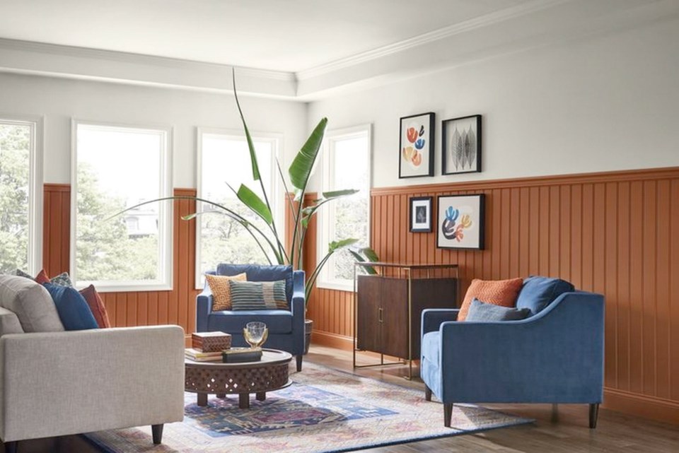
Apply a ledge with trim — a chair rail or picture ledge, and apply the paint. Shown here is a room by Sherwin Williams with the high wall panels painted in Cavern Clay. The blue furnishings pop against this rich neutral, and white upper walls and ceiling keep the room fresh and light.
Imitation tiles are a great treatment for imperfect wood floors. These terra cotta tiles cost a fraction of the real thing and as a bonus, they are not as cold or hard underfoot as stone or clay.
The paint effect is created with the use of a stamp that is cut from a piece of upholstery foam. A 12-inch square is a good size. Slice off one corner. This will create a diamond pattern in the centre of four tiles.
Then cut a diamond shape that is slightly smaller than the space left, so that grout lines will show. Begin by painting the floor with two coats of gray. This will represent the grout lines.
Choose two or three colours, including pink and orange coral and a touch of red/brown. Pour the paints into a large aluminum pan and swirl the paints with a paint stirrer. Don’t overmix, or it will become muddy.
Dip the tile sponge into the paint so the bottom is covered. Dab off excess on a paper towel and then begin your floor design. Start at a corner, stamp, then turn 90 degrees and stamp again.
Repeat four times to complete one section with a diamond in the middle. Leave space for the grout lines and continue the pattern. Cut pieces of foam to size to fit the floor around the edges and corners.
Complete by dipping the diamond sponge into cream paint. Allow the floor to dry and apply three or four coats of acrylic varnish to seal and protect.
Enjoy thinking up places to apply Living Coral.
Look for fabrics in this shade to enhance your rooms. A lampshade or two, pillow slips, window coverings, candlesticks, pots and frames will each bring a happy and comforting note to your home.
Written by Debbie Travis and Barbara Dingle. Please email decorating questions to [email protected]. Follow Debbie at instagram.com/debbie_travis, facebook.com/thedebbietravis, debbietravis.com.


