Harold Town: Works from the Estate, at Winchester Modern, 758 Humboldt St., winchestergalleriesltd.com, 250-382-7750, until Saturday, May 31.
Whether it was Toronto the Good, or simply Hogtown, from the 1950s onward, Harold Town (1924-1990) was unquestionably the premier artist of that city. Iris Nowell has written that his “prodigious output of prints, drawings, sculpture and paintings garnered for him more publicity than all other Canadian artists combined.”
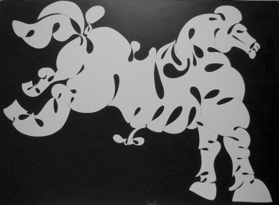
Town’s abstracts won him a place among Painters Eleven, that city’s leading-edge group of modern painters. The unparallelled finesse of his draftsmanship put him in a league of his own. His free-wheeling collages, both large and small, made from all manner of materials, blew out the accepted parameters of art-making at the time.
Beyond his sartorial elegance, it was his outspoken opinions and his presence on the scene on radio and television and in print, that established for him a position no one else could match.
Unusually, Town didn’t drive and generally avoided travel. He didn’t aspire to fame in New York, as so many of his generation did. Thus, the current show in Victoria might be a revelation to local art lovers.
Including 30 works selected from Town’s estate by Toronto’s David Silcox, this choice gathering of small works includes five little canvases rich with colour: some rugged abstractions, and one thick with the tight spatterings of paint that make up his “snap” paintings. There are four of his “single autographic prints” centring on hermetic gestural symbols.
Most appealing are Town’s masterful drawings. Probably inspired by Picasso, he spun out figures from mythology with a sexy, fluid line in pencil or ink and wash. Whether they are cross-hatched, utterly spare or dancing with a sinuous line, they display an easy virtuosity that is so good it makes one doubt his seriousness. Art was no struggle for Harold Town.
These days, virtuoso drawing is neither taught nor practised, and among those who still paint, it seems that “bad” is the new “good.” But you may set your ironic posture aside for a bit and just enjoy this Town show. It’s a lingering look at what happened just before the modern became post-modern.
Ingrid Mary Percy at Polychrome Fine Art, 977-A Fort St., 250-382-2787, polychromefinearts.com until Thursday, May 22.
Ingrid Mary Percy teaches art at the Corner Brook campus of Memorial University of Newfoundland, but spends almost half of each year here in Victoria. She graduated from the University of Victoria with a master of fine art degree and maintains a studio in Chinatown. Her previous exhibitions, at Deluge and Polychrome galleries, have involved “flowers” made from decorative wooden moulding and drawings she made with a Spirograph toy, overprinted with images of Elvis and Cher on black velvet.
When I read her artist’s statement from the previous show, I confess I was a bit daunted going to interview this self-proclaimed conceptual artist. “Considering Deleuze and Guattari’s notion of the rhizome while appropriating iconography and referencing my life, my art practice and the larger world, I power-mix the elements with new materials and processes,” she wrote. “Open ended meta-meshes on the planar field.”
I needn’t have worried. Percy is articulate, full of fun and these days not afraid to show herself as passionate, romantic and poetic. She seems to be allowing her longtime interest in painting to express itself, and is taking lessons in operatic singing. The rigorous formalist who confined herself to black and white is not in evidence this time around.
On show are two new bodies of work. First are irregularly shaped blocks of wood, veneered with thin strips of painted wood — in fact, offcuts from her students’ work assembled by Percy in an intuitive way. Inserted around the perimeters of these “sculptural emblems” are dozens of painted wooden golf tees. Someone pointed out to her that these made the pieces look like African fetishes, which often have nails hammered into them. She then excavated little compartments in the back, for the next owner to enshrine some meaningful object in.
In the end, they are just what you make of them, colourful and slightly mystifying little art objects. Slightly larger versions of this family of objects are faced with wooden strips, which Percy herself painted in bold colours — why let the students have all the fun?
Her creative urge drove her to create random and undisciplined paintings on paper, which she then cut up in free-form snowflakes or flowers or other shapes as they occurred to her. There is a sort of flower power, Partridge Family ethos to her shapes, but they aren’t aiming to explain anything. Percy admitted to me that she assembles them according to her own inner esthetic.
Lest someone think this art work might not be considered serious enough, and might be seen as merely decorative, she let me know that she uses these motifs knowingly, in a sort of post-modern way. She’s referencing domesticity and women’s roles and the blurring representation and abstraction. But you don’t need to know that.
It’s probably enough to recognize her love of rich colour — cadmium yellow deep, phthalo blue turquoise, pure cadmium red light. And while she takes pains to create things that are edgy and unsettling, in fact she has an innate design sense that just won’t let her make an unpleasant composition.