First impressions are important, and that goes for buildings as well as people.
The designer of this house took that approach to heart when she restyled the front entrance of this 1981 home that overlooks Esquimalt Lagoon and the distant ocean.
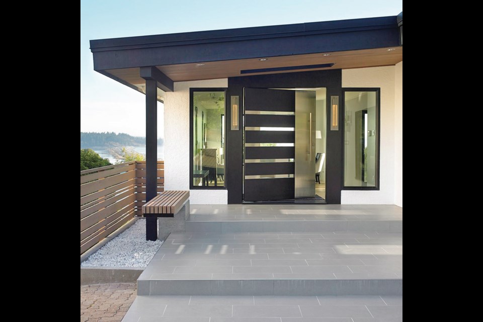
“The new front door is a masterpiece made by a fabulous door maker called Aaron Stevenot at Karmanah Custom Joinery,” said Ines Hanl, principal of The Sky is the Limit Interior Design Concepts, whose goal in this renovation was to make the home’s entry as exciting and contemporary as its newly remodelled interior.
The pivoting, custom door features black-stained oak that is inset with five-centimetre-wide insulated glass strips, with a vertical stainless steel panel at the side. It is a massive piece — measuring 1.5 metres wide and more than two metres high — but is so well balanced and the hardware “so phenomenal” that even a two year old could open it, said Hanl.
The designer added broad grey tiled steps up to the door, extended and angled the overhead canopy to provide more protection from the elements and created a cantilevered bench at the side.
Flanked by a gravel strip, the bench rests on a concrete plinth and hangs over the step, so a tall person with long legs, and a short person, can comfortably sit side by side.
Inside the foyer, Hanl created another dramatic space, with a rectangular, geometric pattern inlaid into the blond oak flooring, and a contrasting dark step to replace two former side stairs.
The three-storey house looks like a one-level, modest home from the street, but it steps down the back slope and has a spacious 1,500 square feet on each floor. The owners, who did not want to be identified, loved the original 35-year-old house but wanted to update its entertainment areas on the entry level, which meant Hanl focused on the kitchen, family, media, dining and living rooms at this stage. Lower level bedrooms, offices, library and rumpus room might be refreshed at a later date.
Hanl said the home had many attractive qualities to begin with, and a relatively open floor plan, but it lacked light and one or two aspects needed rethinking, especially the family room’s massive brick fireplace. “It would have looked wonderful in a big Tuscan restaurant or a trattoria,” but was overpowering in the family room, she said. By removing it, they added extra space and were able to orient the furniture differently, toward a much smaller electric fireplace on the opposite wall.
“The house needed to be opened up a bit, but we didn’t do many structural changes except for moving two kitchen walls back about a metre each, adding new skylights and increasing the window size.”
The kitchen is almost unrecognizable when compared with the earlier version. The owners didn’t want a backsplash and because they collect ammonites( a type of fossil) Hanl came up with the idea of showcasing one of their pieces in a black shadowbox behind the sink.
“We didn’t have much area so we punched a hole in the wall and recessed it in a watertight, stainless steel frame,” Hanl said.
The cabinets are Italian laminates with a subtle texture — “very sophisticated and organic feeling” — and she chose “endless” steel handles and created a stainless steel inset to match.
> See ORIGINAL, page E8
The countertops are flush with the cabinet doors, and the stainless steel shadow line is recessed for a sleek accent under the polished quartz countertops.
“It was quite tricky, but I love it when a design element is really well done. It’s like ballet: you don’t see the blood, sweat and tears that went into the performance.”
A new pantry wall has ovens and coffeemaker on one side, and an electric fireplace on the other, and hidden inside are the all the necessary structural supports: a steel beam and post.
The living room always had good-sized picture windows, considered large back in the day, but the owners decided to enlarge them further by raising the tops and lowering the bottoms to maximize the lagoon view.
Before the reno, the home had wooden ceilings and this became a huge discussion point as the owners didn’t want to give them up, but because of extra lighting and electrical work that had to be done in the ceilings “there came a point of no return,” said Hanl. “We were all happy in the end because the spaces are much brighter now.” (New lighting fixtures include exterior sconces at the front door and floor lamp in the family room by Hubbardton Forge, through Illuminations Lighting Solutions.)
Along with the new lighting came a new colour palette and Hanl chose six different tones of greyish-blue paint on the walls to enhance the lofty feeling of living high in the sky. “It’s very subtle and amazing what this colour can do. It feels like the house is floating.”
While the two custom doors were very special, the designer stressed that everything else in the home was very common sense and certainly not over the top, yet the look is high end thanks to the thoughtful design and expert workmanship of R. Parsons Construction.
“Ines does spectacular work and Rob Parsons is a wonderful builder, someone who really knows his craft and is so diligent,” said the owner (wife), who noted the family, including two toddlers, lived downstairs throughout the four-month renovation.
“Ines just kept coming up with new ideas and we were happy to be open-minded about it. She has some extremely sophisticated taste and Rob too has a lot of ideas about how to tackle things.
“This home originally had beautiful west coast modern bones and charming views, but things like the custom artisan fireplace were not really to our taste. It was very rustic. And other things just didn’t go with a new, very modern décor.”
She said they decided to concentrate on upgrading the main floor “because it’s the centre of everything and where we do all our entertaining.”
The kitchen layout suits the family much better now. “It is much more functional thanks to the added storage and the way the appliances are arranged. And we use the blackboard all the time for notes and our children’s art.
“We come upstairs every morning now and feel so happy in this bright, airy place. The transformation is wonderful.”
She added taking out the large fireplace was the right decision.
“It was a massive demolition job and it left a big gaping hole which I thought would be terrifying, but it was actually really liberating. Ines had sketched out how it would look once it was gone and she was utterly right.”
The project earned several CARE awards in 2015, a gold for the best contemporary kitchen under 175 square feet and best renovation under $200,000. It also won silver for best millwork and best interior design, and took the award for best small kitchen from the B.C. chapter of National Kitchen & Bath Association in 2014.